The collection had strong individual images, but needed a campaign idea that connected comfort, function and everyday styling.
INDEPENDENT CAMPAIGN CONCEPT / 2026
Soft
Utility
for COYSEIO
COLLECTION IMAGE / COYSEIO 2026 FALL WINTERPROJECT OVERVIEW
How can an existing collection become a clear seasonal campaign?
Translate COYSEIO's recognisable layering into one ownable winter narrative without changing the garments.
COYSEIO's creative team, fashion employers and style-aware urban customers aged 18–30.
Campaign concept · 7 styled looks · 9 posters · social system · digital case study
CONCEPT EVOLUTION / WHY IT EXISTS
Research became
a campaign proposition.
The concept was not chosen first and justified later. It emerged from a sequence of observations about COYSEIO's existing visual behaviour and a communication opportunity I could contribute to.
Brand research
Repeated layering, restrained palettes and character-led photography.
→Observation
Comfort and unusual proportion already coexist in COYSEIO's visual world.
→Insight
The collection could be easier to read when warmth and function share one story.
→Opportunity
Build a winter campaign that connects complete looks to everyday use.
→Soft Utility
Name the balance between emotional comfort and practical dressing.
→Campaign system
Apply the idea through styling records, posters, social assets and a digital case study.
INDUSTRY VALIDATION / EVIDENCE BEFORE PREFERENCE
What did I learn—
and what changed?
I used first-party brand material as the primary source, then compared it with contemporary Korean fashion presentation and peer discussion. The purpose was not to copy a look, but to turn observations into defensible styling and communication decisions.
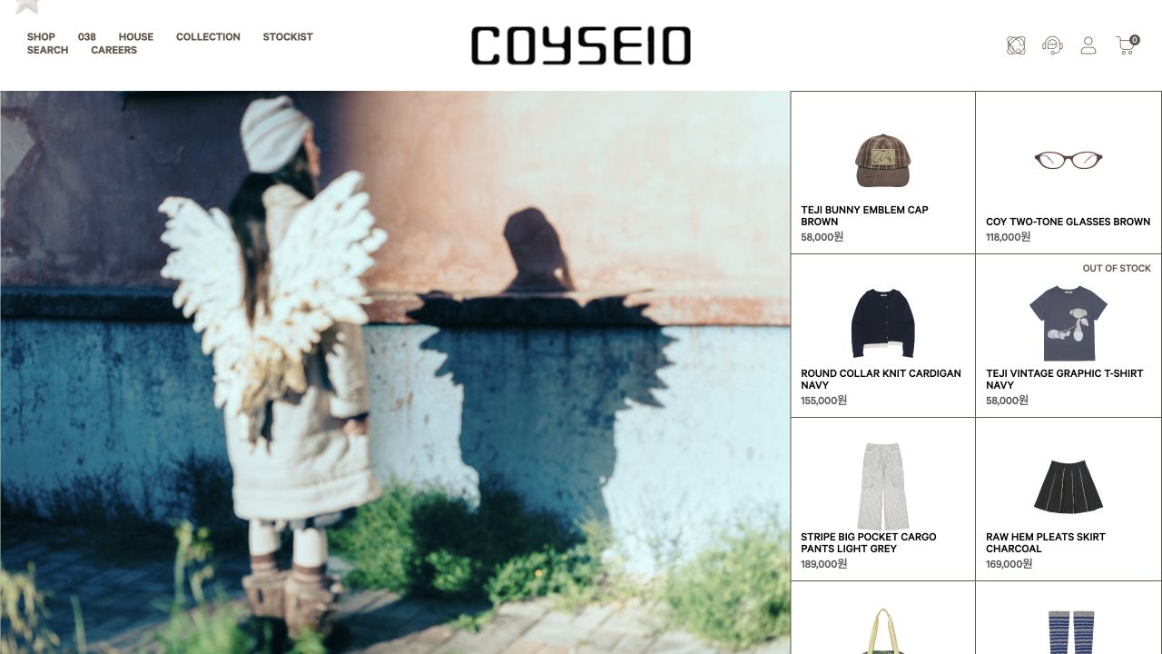
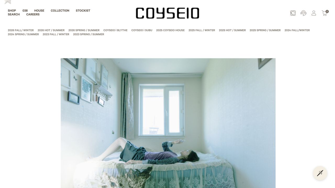
Product-led worlds
Official lookbooks connect garments through recurring colour, silhouette and character. I responded by building complete looks before designing graphics.
Official 2026 F/W source ↗Context clarifies concept
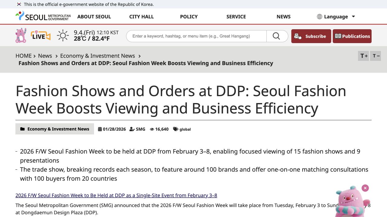
Recent Seoul Fashion Week formats use runway, presentation and showroom views to communicate products from multiple angles. I applied that lesson through full-body checks, details and documented styling logic.
Official Seoul source ↗Name only what is verified
I checked official product and category pages for knit, pleated skirt and sock construction. Where an exact lookbook-to-SKU match is not verifiable, I mark identification pending rather than guess.
Official COYSEIO source ↗Theme: establish one dominant silhouette and reduce simultaneous bulky layers so the styling remains wearable.
PARAPHRASED KOREAN PEER DISCUSSION — WORDING TO CONFIRM BEFORE SUBMISSIONTheme: repeat colour through smaller accessories and let practical footwear support, rather than compete with, the outfit.
PARAPHRASED KOREAN PEER DISCUSSION — WORDING TO CONFIRM BEFORE SUBMISSIONI reduced unnecessary volume, strengthened colour rhythm and checked every selected look at full-body scale.
CONCEPT DEFINITION / WHY THIS IDEA
Soft
Utility
Soft Utility explores the balance between comfort and function, combining relaxed silhouettes, layered styling and tactile materials with practical everyday garments for contemporary urban life.
Comfort you can see.
- Emotional comfort
- Warmth and layering
- Relaxed silhouettes
- Tactile materials
- Approachable lifestyle
Function you can feel.
- Functionality
- Practicality
- Versatility
- Everyday wear
- Urban, efficient dressing
SOFT+UTILITY=Warmth without restriction.
Function without hardness.
Function without hardness.
MY CONTRIBUTION
I designed the campaign,
not the garments.
COYSEIO created the clothing and original collection photography. My contribution was to analyse, select, combine and communicate those products through an original campaign system.
- Campaign Designer
- Visual Designer
- Art Director
- Stylist
- Brand Researcher
- Conducted brand and audience research
- Developed the Soft Utility concept
- Selected and styled garment combinations
- Directed colour, proportion and visual narrative
- Designed posters, social assets and digital experience
- Documented testing and refinement
WHY COYSEIO? / DESIGN VALUES
A natural alignment,
not an imitation.
I chose COYSEIO because its visual language makes room for the same qualities I value in my own practice: restraint, purpose, emotion and material awareness.
01
Minimalism
I appreciate restrained visual communication. Quiet framing gives proportion and detail space to speak.
02
Functionality
I enjoy designing with purpose rather than decoration. Each layer should contribute to use, balance or meaning.
03
Storytelling
I believe clothing communicates emotion and identity. Styling can turn individual products into a believable character.
04
Materiality
I am drawn to texture, layering and tactile experiences. Material contrast can make warmth visible before it is felt.
Rather than adapting my style to fit COYSEIO, I discovered that my existing design values naturally align with the brand's philosophy.
DESIGN PROCESS / WHY EACH STEP MATTERED
From observation
to an employable outcome.
Research
Find repeated visual behaviour.
Brand analysis
Turn observations into rules.
Concept
Name the strategic tension.
Product selection
Choose garments that prove it.
Styling
Build colour and proportion stories.
Testing
Check winter weight and full-body scale.
Refinement
Respond to feedback, not taste alone.
Final campaign
Apply one system across formats.
PROJECT PROGRESS / EVIDENCE OF EVOLUTION
Make. Check.
Reject. Refine.
Each test answered a specific question. The evidence below shows why the campaign moved from a light visual mood toward clearer winter weight, more legible product combinations and a repeatable graphic system.
Which products can carry the idea?
I compared silhouette, colour and layering potential before choosing hero looks. This prevented the graphics from deciding the styling.
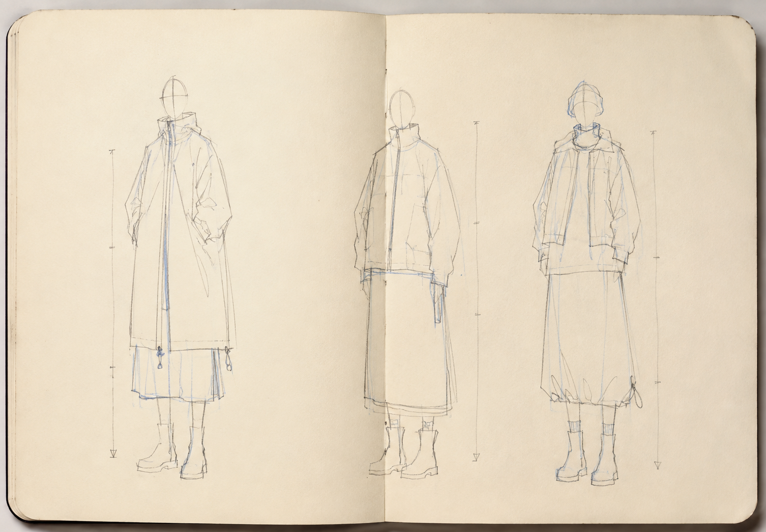
Can the silhouette read quickly?
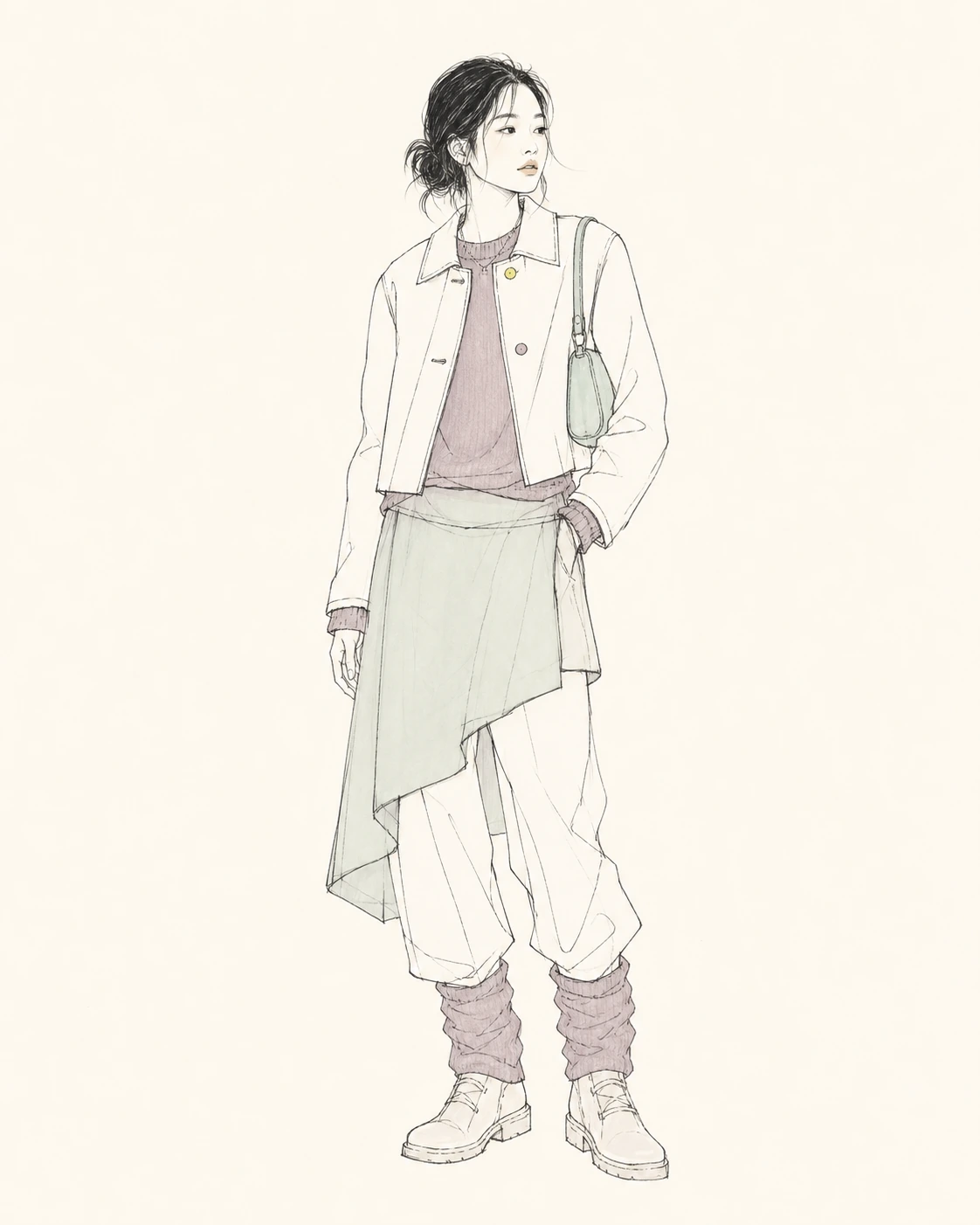
Simple line studies isolated outer volume, hem length and lower-body balance without pretending the garments were my designs.
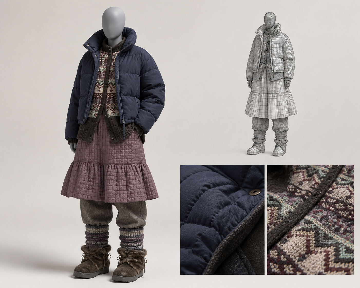
Is more padding always warmer?
No. The heavier 3D test obscured the body and felt costume-like, so I rejected simultaneous bulk across every layer.
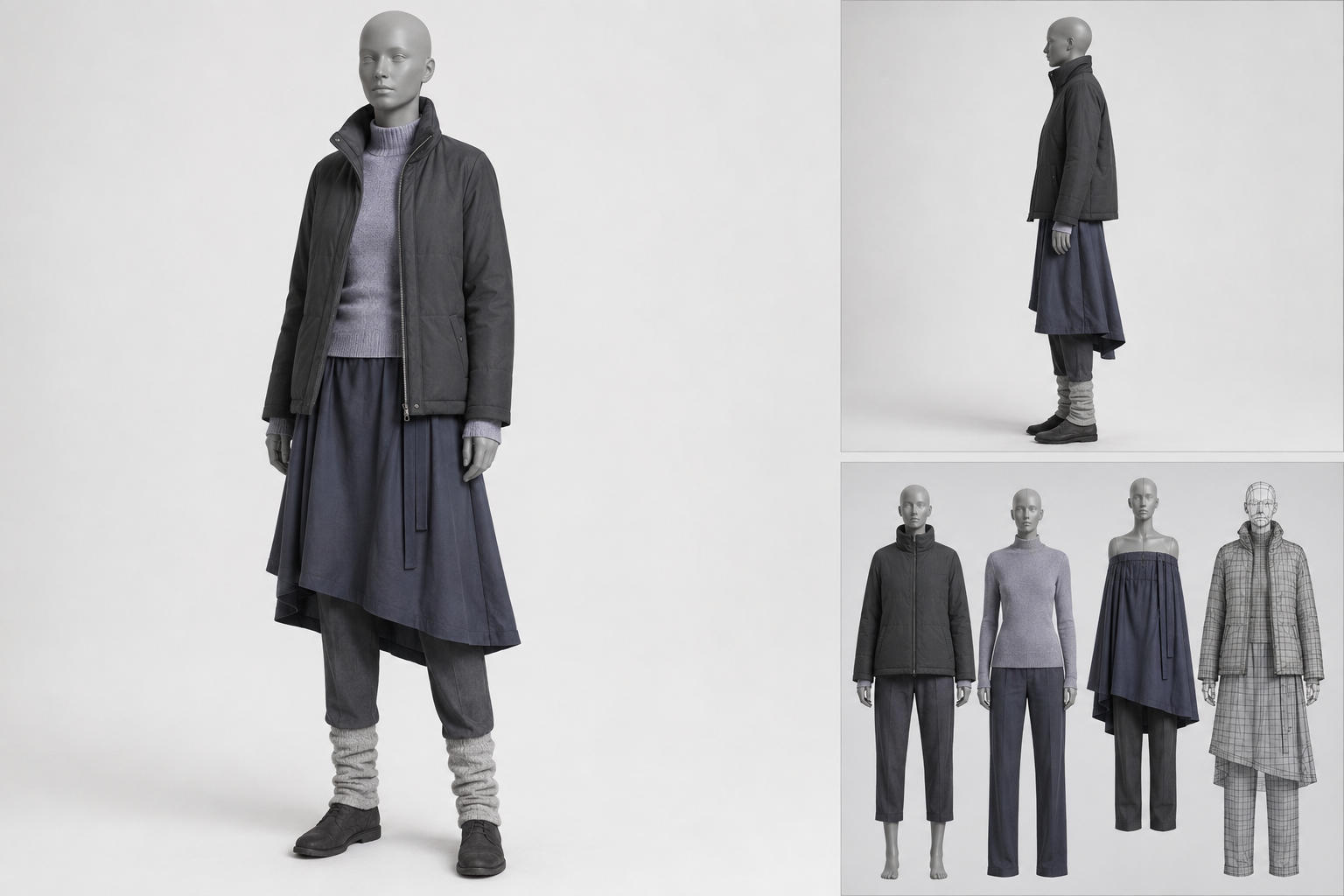
Where should warmth remain?
I kept tactile knit, longer hems and leg layers, but reduced competing volume around the torso for a clearer, more wearable result.
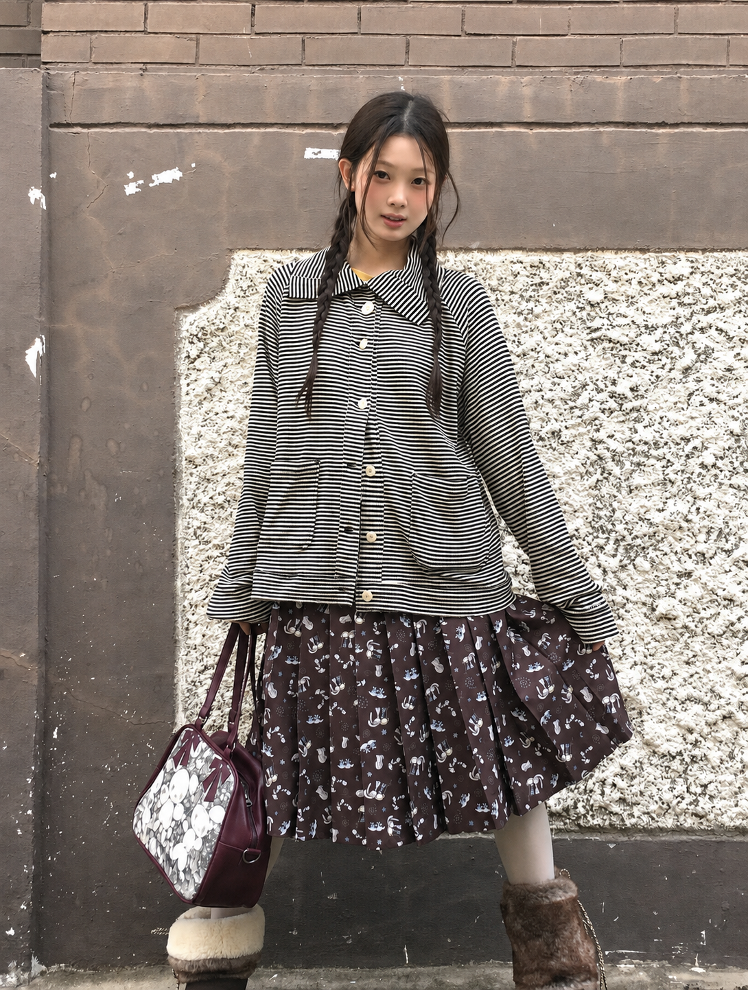
Does the final styling still read?
The complete figure confirms head-to-toe proportion, practical footwear and the relationship between top and lower-body layers.
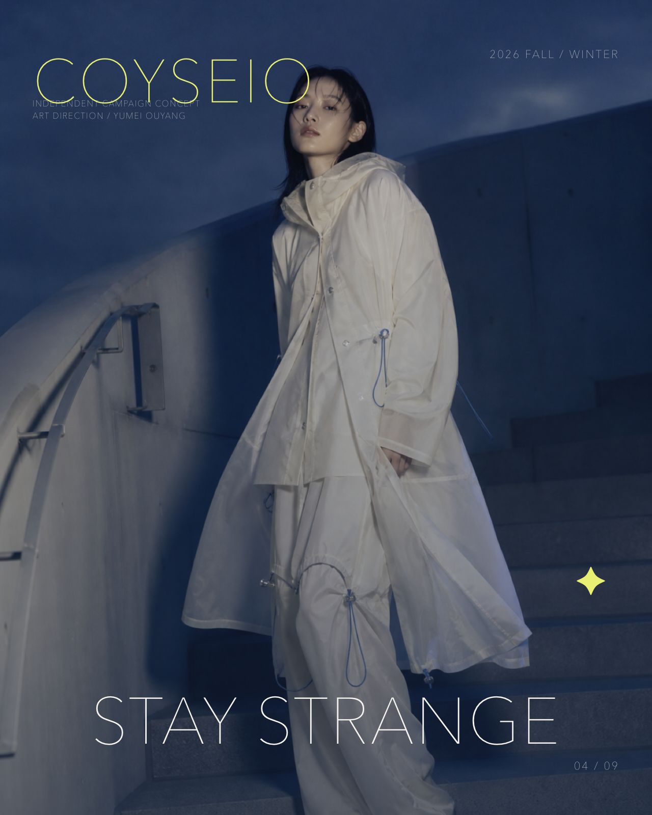
Can one idea survive a new format?
I tested type, colour and hierarchy at poster scale so Soft Utility remained recognisable without hiding the outfit.
PRODUCT SELECTION + STYLING / LOOK 1–7
Seven looks.
Seven decisions.
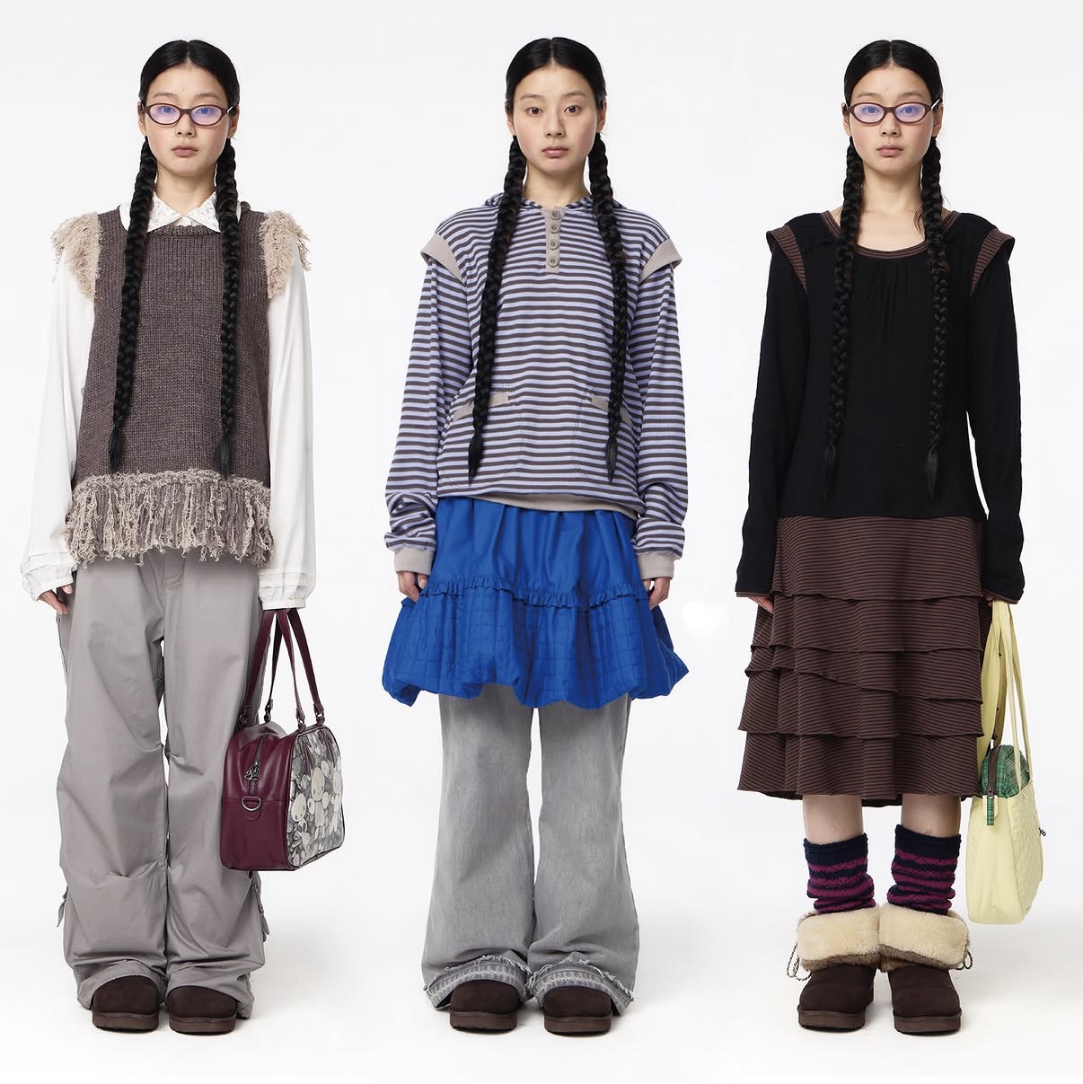
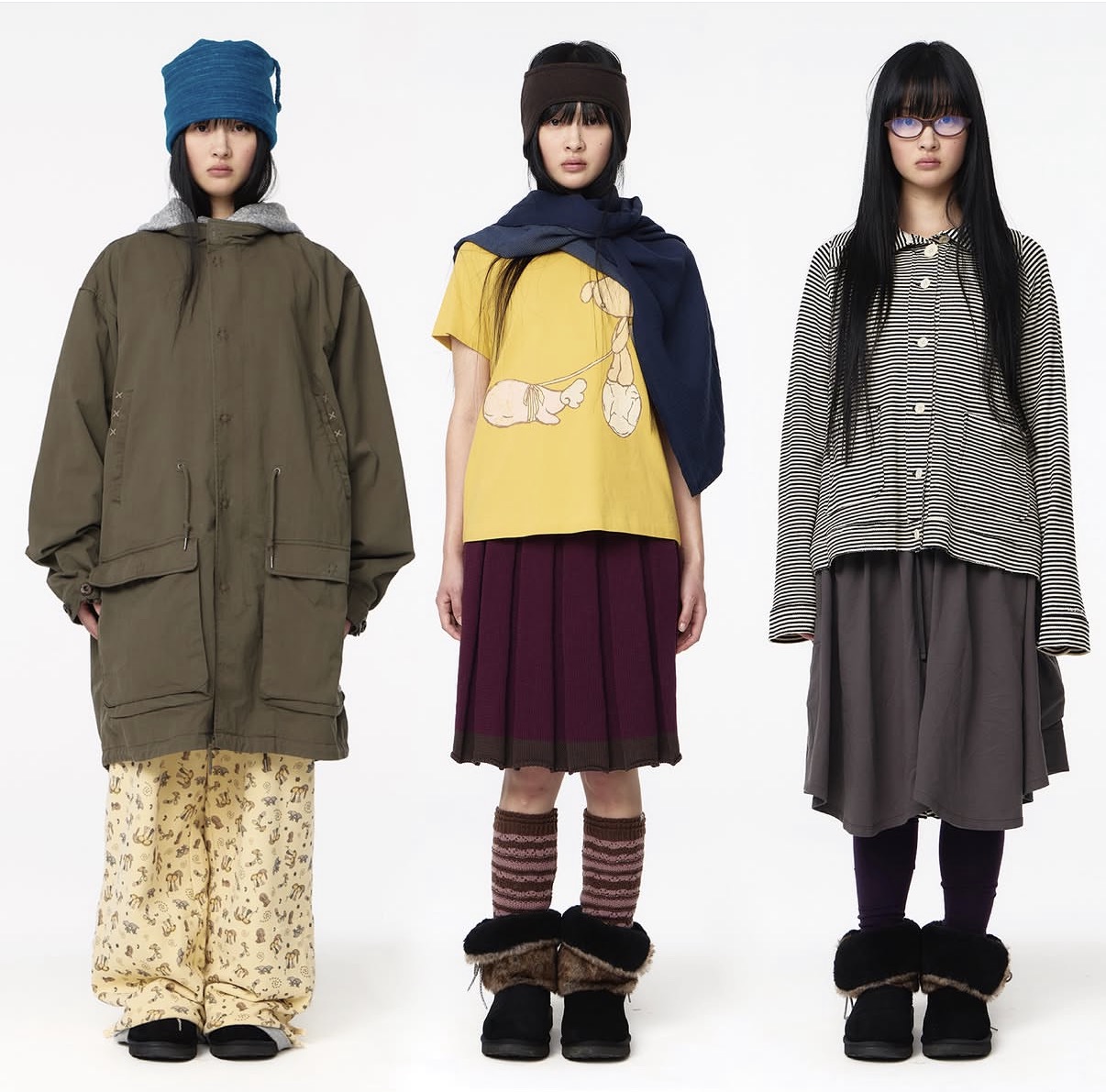
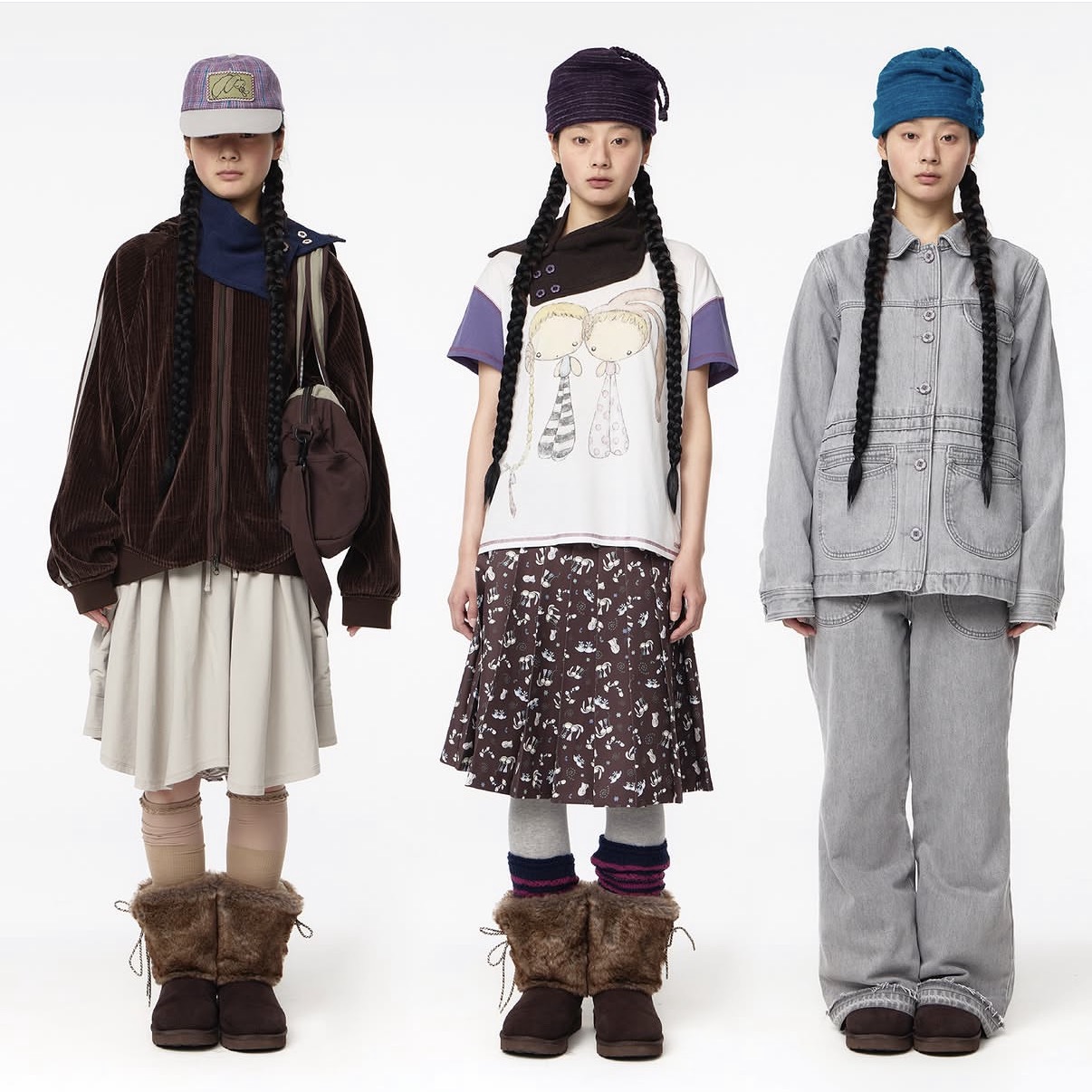
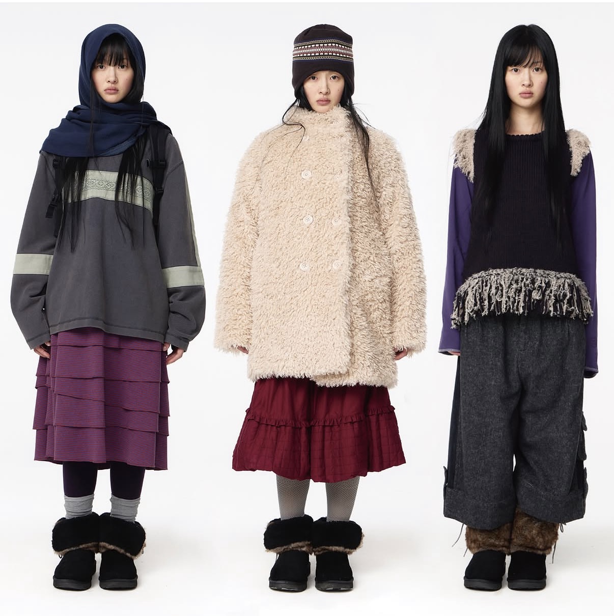
I did not design these garments. I selected products from the supplied COYSEIO collection, built outfit combinations and tested how each look could express the Soft Utility concept. Category descriptions are based on visual evidence; exact lookbook-to-SKU identification remains pending unless a product is confirmed on the official site.
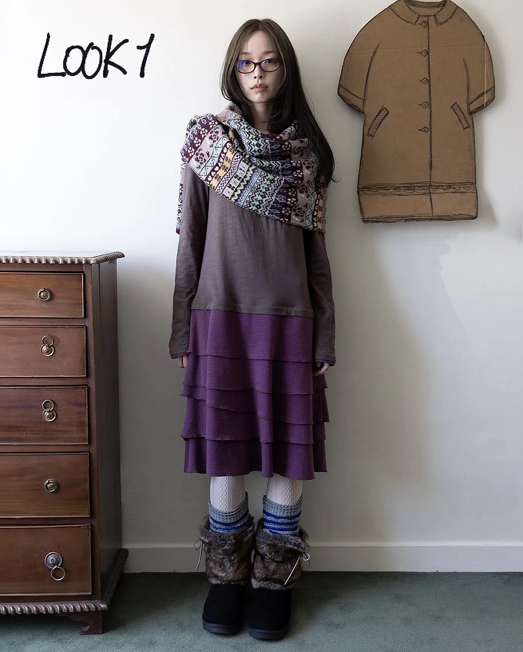
LOOK 01
- SELECTED PRODUCTS
- Fine-knit top · patterned knit wrap · tiered skirt · lace tights · leg warmers · fur boots
- PRODUCT STATUS
- Exact product identification pending · official lookbook source ↗
- STYLING DECISIONS
- I used the oversized wrap to connect the fitted top with the wide tiered skirt, repeating mauve and brown from shoulder to hem.
- WHY SOFT UTILITY?
- Tactile knit and gathered volume communicate Soft; removable layers and a practical boot base communicate Utility.
- MY CONTRIBUTION
- Garment selection · proportion balance · colour linking · styling narrative
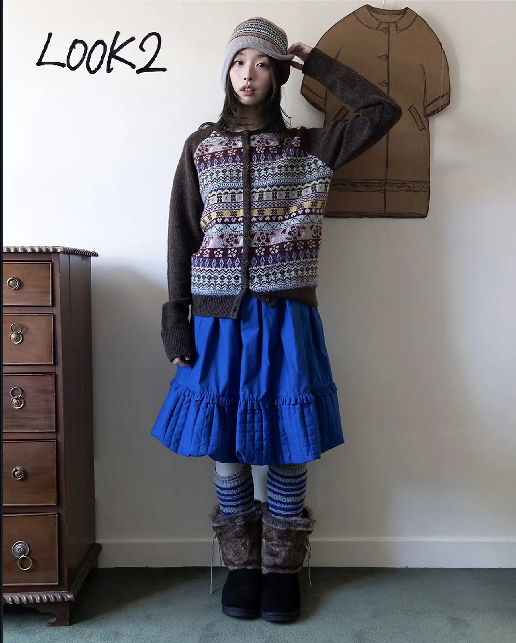
LOOK 02
- SELECTED PRODUCTS
- Fair Isle cardigan · quilted blue skirt · knit cap · tights · striped leg warmers · fur boots
- PRODUCT STATUS
- Exact product identification pending · official lookbook source ↗
- STYLING DECISIONS
- I paired dense heritage knit with bright quilted volume, then repeated blue at the calf to make the outfit read as one system.
- WHY SOFT UTILITY?
- Warm pattern and padding create comfort, while the cardigan, skirt and accessories can separate into versatile everyday combinations.
- MY CONTRIBUTION
- Layer sequence · colour rhythm · winter-weight refinement · hero-look selection
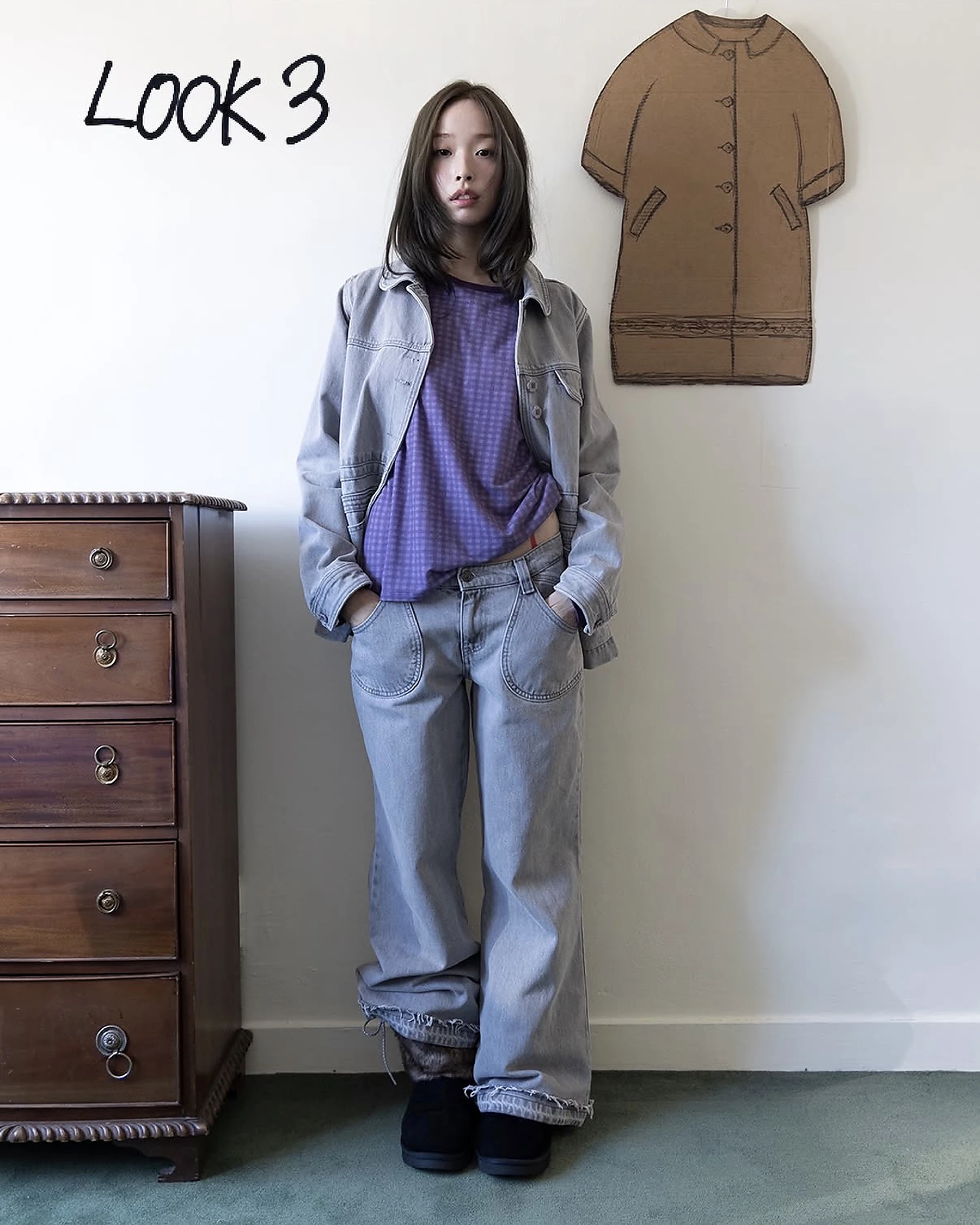
LOOK 03
- SELECTED PRODUCTS
- Grey denim jacket · lilac check top · wide-leg jeans · leg warmers · fur boots
- PRODUCT STATUS
- Exact product identification pending · official lookbook source ↗
- STYLING DECISIONS
- I built a low-contrast denim column, using lilac as a quiet focal point and pooling the jeans over the boots for a relaxed silhouette.
- WHY SOFT UTILITY?
- The loose fit feels approachable and soft; denim, pockets and durable separates support everyday urban movement.
- MY CONTRIBUTION
- Tonal styling · silhouette edit · focal-colour placement · casual utility direction
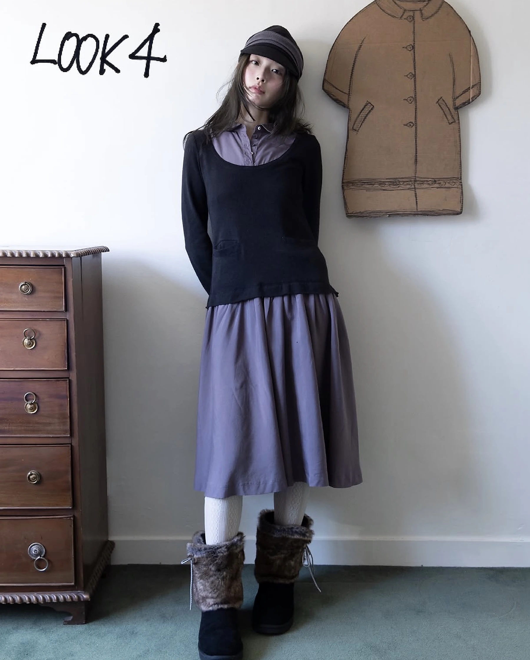
LOOK 04
- SELECTED PRODUCTS
- Layered collared shirt · black scoop-neck top · gathered lilac skirt · soft cap · tights · fur boots
- PRODUCT STATUS
- Exact product identification pending · official lookbook source ↗
- STYLING DECISIONS
- I framed the lilac collar with a dark outer layer and kept the skirt volume clean, creating a soft uniform with a clear neckline hierarchy.
- WHY SOFT UTILITY?
- Gentle drape and muted lilac express emotional softness; simple pull-on layers make the outfit efficient and wearable.
- MY CONTRIBUTION
- Neckline layering · volume control · palette restraint · approachable styling
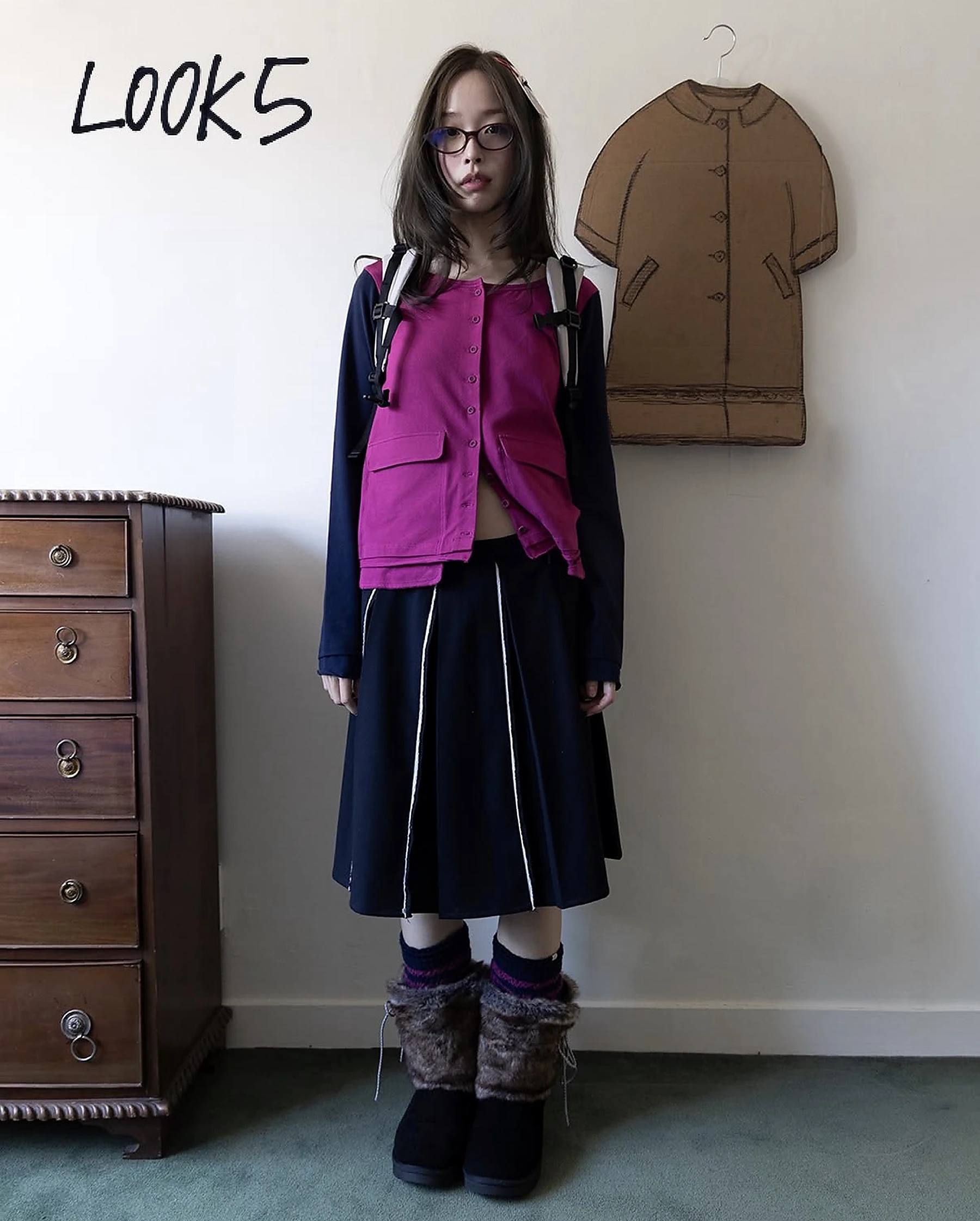
LOOK 05
- SELECTED PRODUCTS
- Fuchsia utility vest · navy long-sleeve top · piped pleated skirt · backpack harness · socks · fur boots
- PRODUCT STATUS
- Exact product identification pending · official lookbook source ↗
- STYLING DECISIONS
- I treated the vivid vest as the functional centre, anchoring it with navy and echoing strap lines through the skirt piping.
- WHY SOFT UTILITY?
- The saturated colour keeps the look playful and human, while pockets, straps and hands-free carrying make Utility explicit.
- MY CONTRIBUTION
- Functional-product focus · accent-colour strategy · line coordination · campaign character
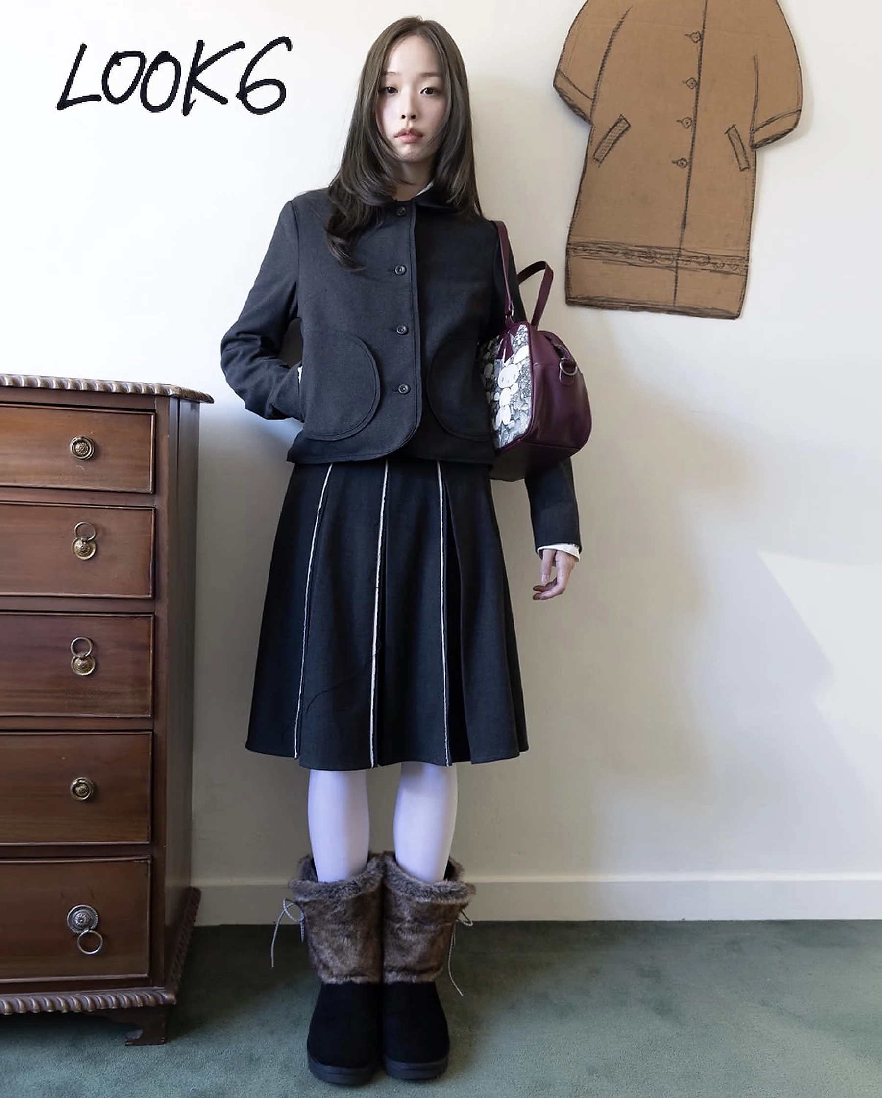
LOOK 06
- SELECTED PRODUCTS
- Charcoal button jacket · piped pleated skirt · white tights · embellished shoulder bag · fur boots
- PRODUCT STATUS
- Exact product identification pending · official lookbook source ↗
- STYLING DECISIONS
- I combined a compact jacket with a controlled A-line skirt, using curved pockets and white piping to soften the dark structure.
- WHY SOFT UTILITY?
- Rounded construction brings warmth to a practical jacket-and-skirt uniform designed for repeated everyday wear.
- MY CONTRIBUTION
- Proportion refinement · detail repetition · accessory choice · polished utility styling
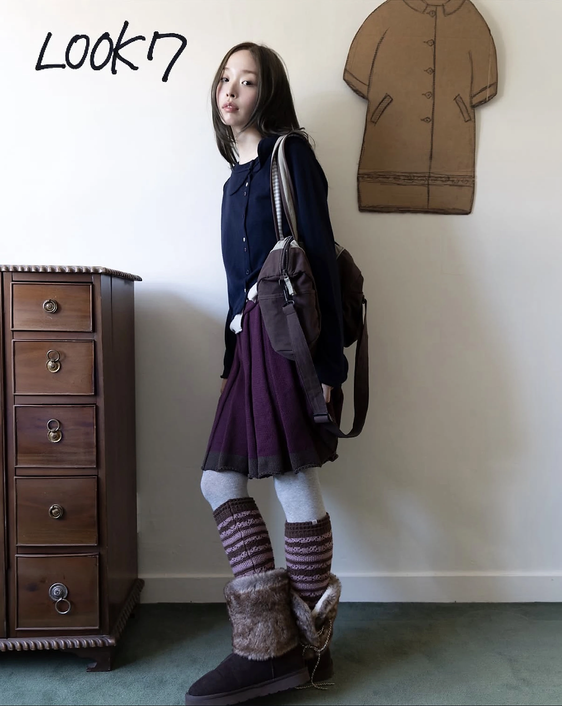
LOOK 07
- SELECTED PRODUCTS
- Navy cardigan · plum pleated knit skirt · grey tights · striped leg warmers · shoulder bag · fur boots
- PRODUCT STATUS
- Exact product identification pending · official lookbook source ↗
- STYLING DECISIONS
- I layered slim knits over soft pleats and extended the plum-to-brown palette through the leg warmers, bag and boots.
- WHY SOFT UTILITY?
- The tactile lower-body layers feel warm and personal; the cardigan and shoulder bag keep the look practical for daily life.
- MY CONTRIBUTION
- Everyday styling · tactile layering · colour transition · closing-look direction
01
Brand code matrix
Repeated visual signals become practical rules for my campaign.
| Signal | Observed evidence | Design implication |
|---|---|---|
| Colour | Washed navy, mauve, brown and mint with occasional bright accents. | Keep the field quiet; use acid yellow only as a small visual trigger. |
| Silhouette | Layered, oversized and soft forms mix comfort with unusual proportion. | Show the complete body and let garments create the main graphic shape. |
| Image-making | Domestic rooms, flash photography and surreal outdoor moments coexist. | Balance familiarity with one strange or dreamlike intervention. |
| Typography | Technical display lettering sits beside handwritten look numbers. | Pair controlled sans serif type with small human imperfections. |
| Tone | Intimate, observant and playful rather than polished or corporate. | Use minimal copy and let atmosphere carry the emotional message. |
02
Audience segments
The campaign speaks to different levels of familiarity with independent fashion.
| Segment | Motivation | Behaviour | Friction |
|---|---|---|---|
| Core collector | Distinctive pieces and brand belonging. | Follows drops, saves styling references and buys selectively. | Needs clear garment detail and availability. |
| Visual explorer | Fresh imagery and identity inspiration. | Discovers through Instagram, reposts and moodboards. | May admire the world without understanding the product. |
| Practical creative | Comfortable clothes that still feel personal. | Compares fabric, fit and styling versatility before buying. | Experimental styling can appear difficult to wear. |
03 / PRIMARY PERSONA
Mina Kim, 23
Visual design student · Part-time stylist · Seoul
Mina uses clothing to communicate personality without sacrificing comfort. She follows independent Korean labels, saves complete looks rather than isolated products, and prefers pieces that can shift between university, studio work and weekends.
- DISCOVERY
- Instagram, styling accounts, friends and small concept stores
- BUYING TRIGGER
- A memorable silhouette supported by clear fabric and fit information
- VALUES
- Individuality, comfort, emotional storytelling and longevity
CORE NEED
“I want clothes that feel comfortable enough for everyday life, but still look like me.”
- Expressive, not costume-like
- Layered, but easy to understand
- Visual campaign linked clearly to product
TUTOR FEEDBACK / RESPONSE / EVIDENCE / RESULT
Feedback became
visible change.
I treated each question as a missing piece of communication. The response was not another explanation paragraph; it was a new piece of evidence inside the case study.
- TUTOR FEEDBACK
- “What does ‘Soft Utility’ mean?”
- MY RESPONSE
- I separated Soft and Utility into two clear design principles.
- EVIDENCE
- Dedicated concept definition and concept-evolution timeline.
- RESULT
- The title now works as a strategic idea, not a decorative phrase.
- TUTOR FEEDBACK
- “What did you actually do?”
- MY RESPONSE
- I distinguished COYSEIO's garments and photography from my campaign work.
- EVIDENCE
- My Contribution section and a four-part record for every look.
- RESULT
- A reviewer can identify my decisions, responsibilities and authorship immediately.
- TUTOR FEEDBACK
- “Why are these looks combined?”
- MY RESPONSE
- I documented product categories, proportion, colour rhythm and layer sequence.
- EVIDENCE
- Seven styling case studies plus full-body and winter-weight checks.
- RESULT
- The looks now demonstrate repeatable styling logic rather than taste alone.
- TUTOR FEEDBACK
- “What would you send to the company?”
- MY RESPONSE
- I defined a professional package instead of presenting an open-ended experiment.
- EVIDENCE
- Live case study, campaign system, nine posters and concise presentation PDF.
- RESULT
- The project now has a clear employment-facing final deliverable.
CAMPAIGN OUTCOME
Move softly.
Stay strange.
CAMPAIGN FILM / FINAL DIGITAL OUTCOME
Soft Utility
in motion.
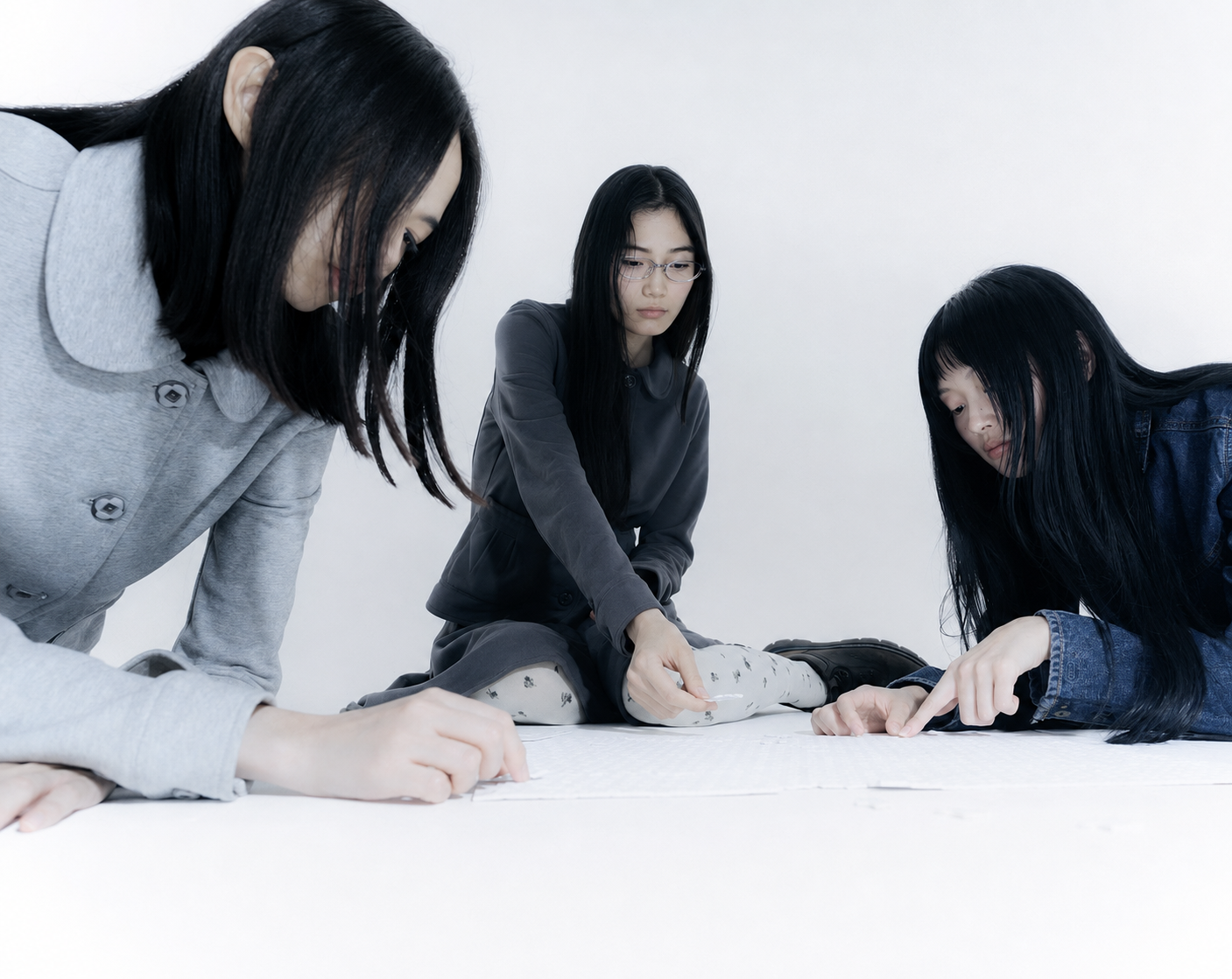
The final film brings the styling study, seven-look system and campaign atmosphere into one continuous digital outcome. COYSEIO garments and imagery are reinterpreted through my campaign direction, edit and visual storytelling.
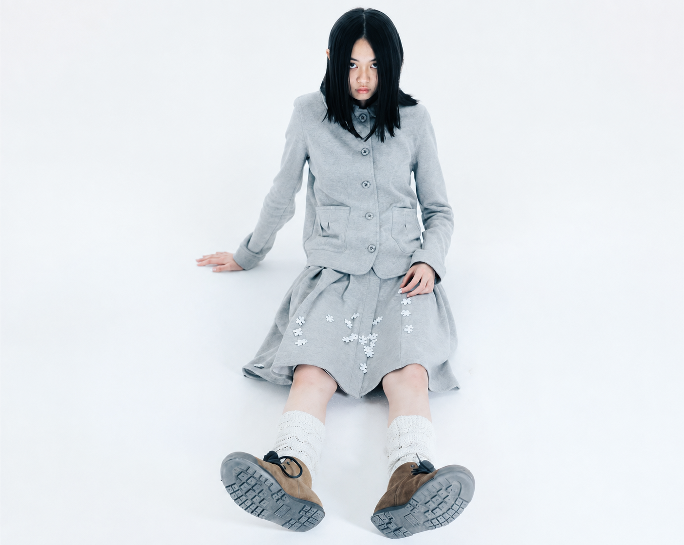
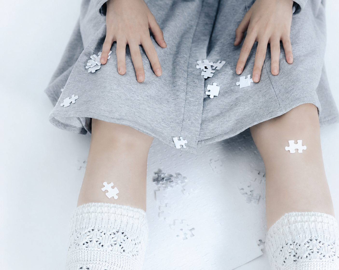
CAMPAIGN OUTCOME / 3 MODELS · 9 POSTERS
Nine ways into
one winter world.
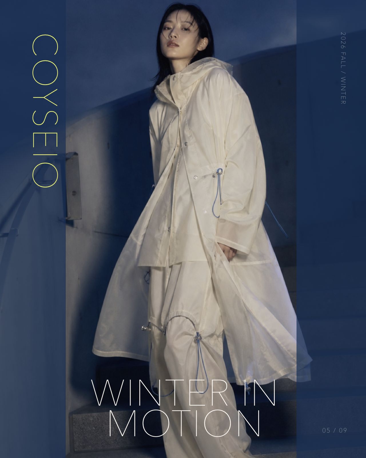
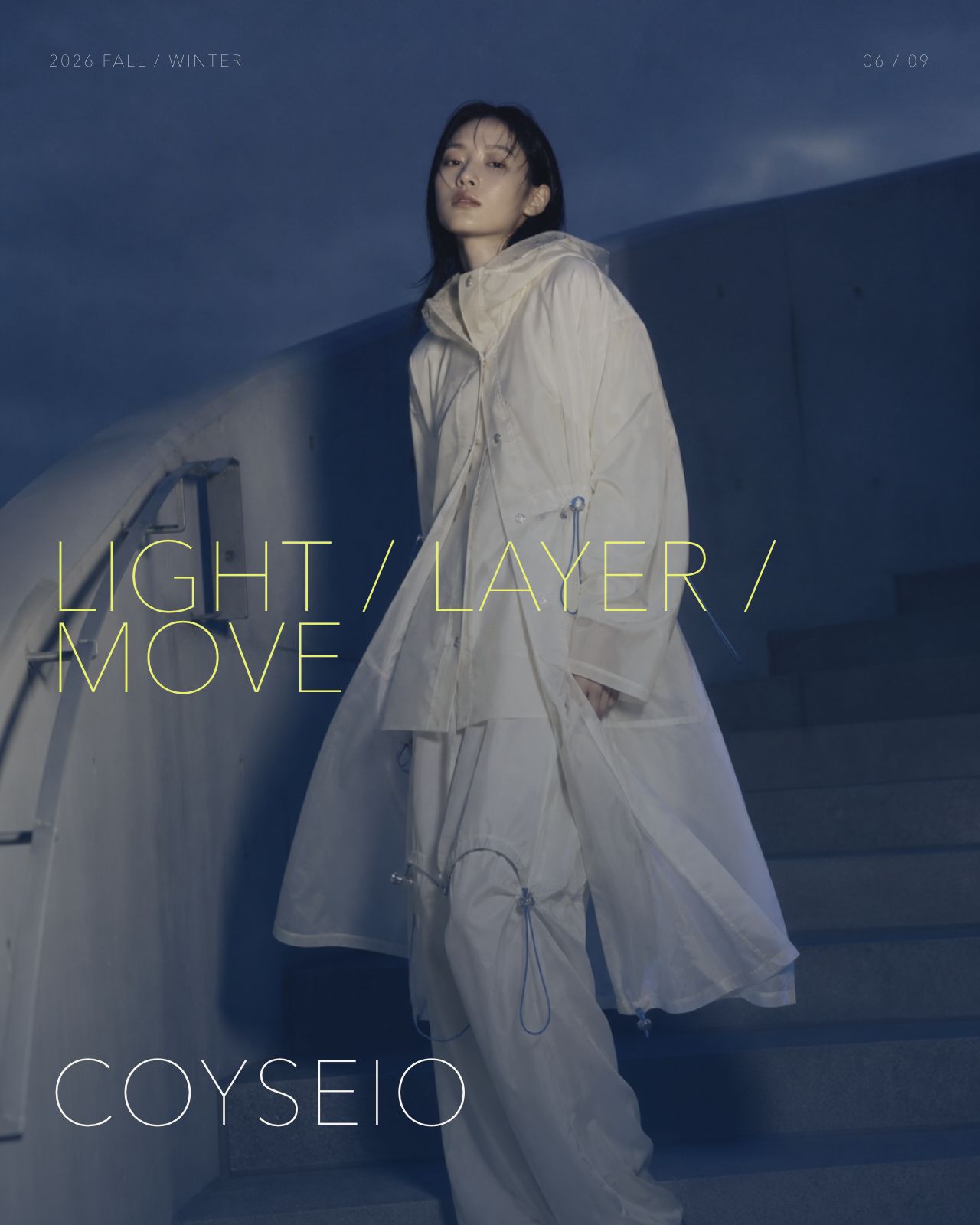
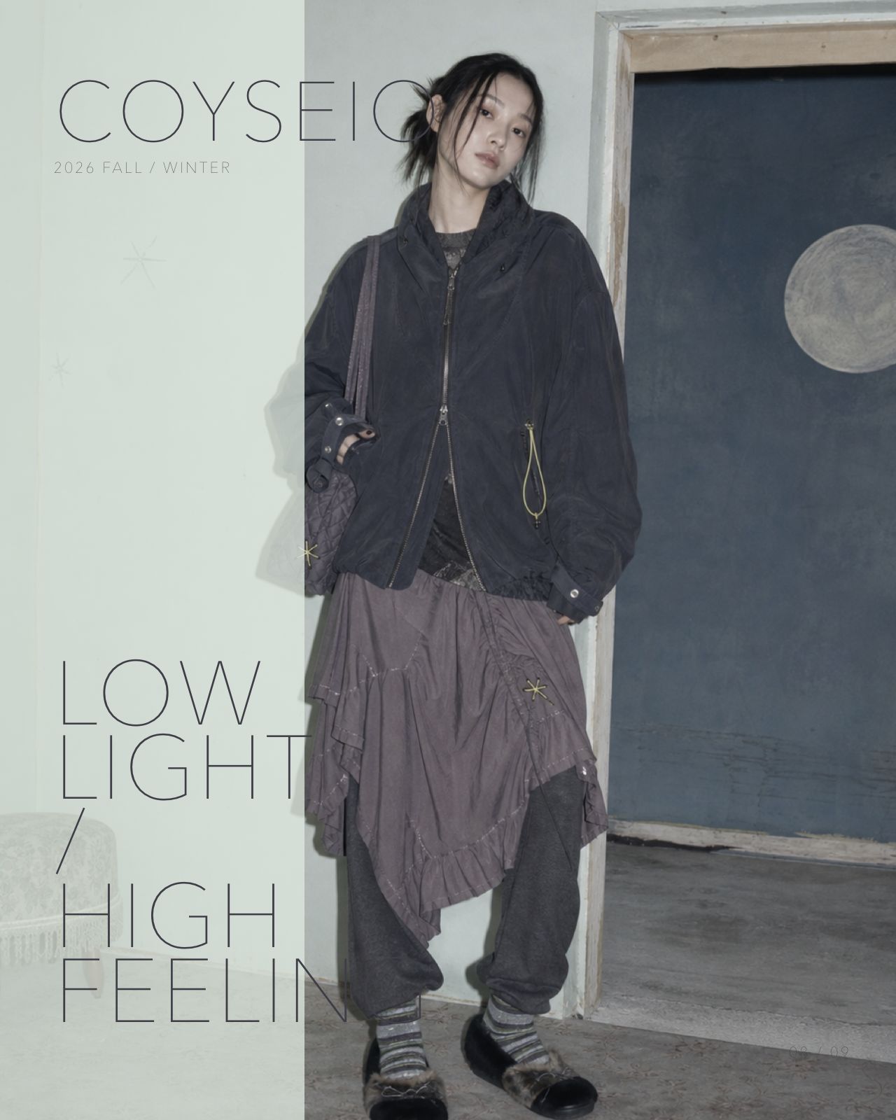
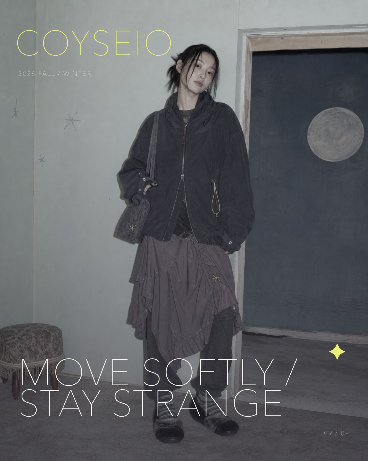
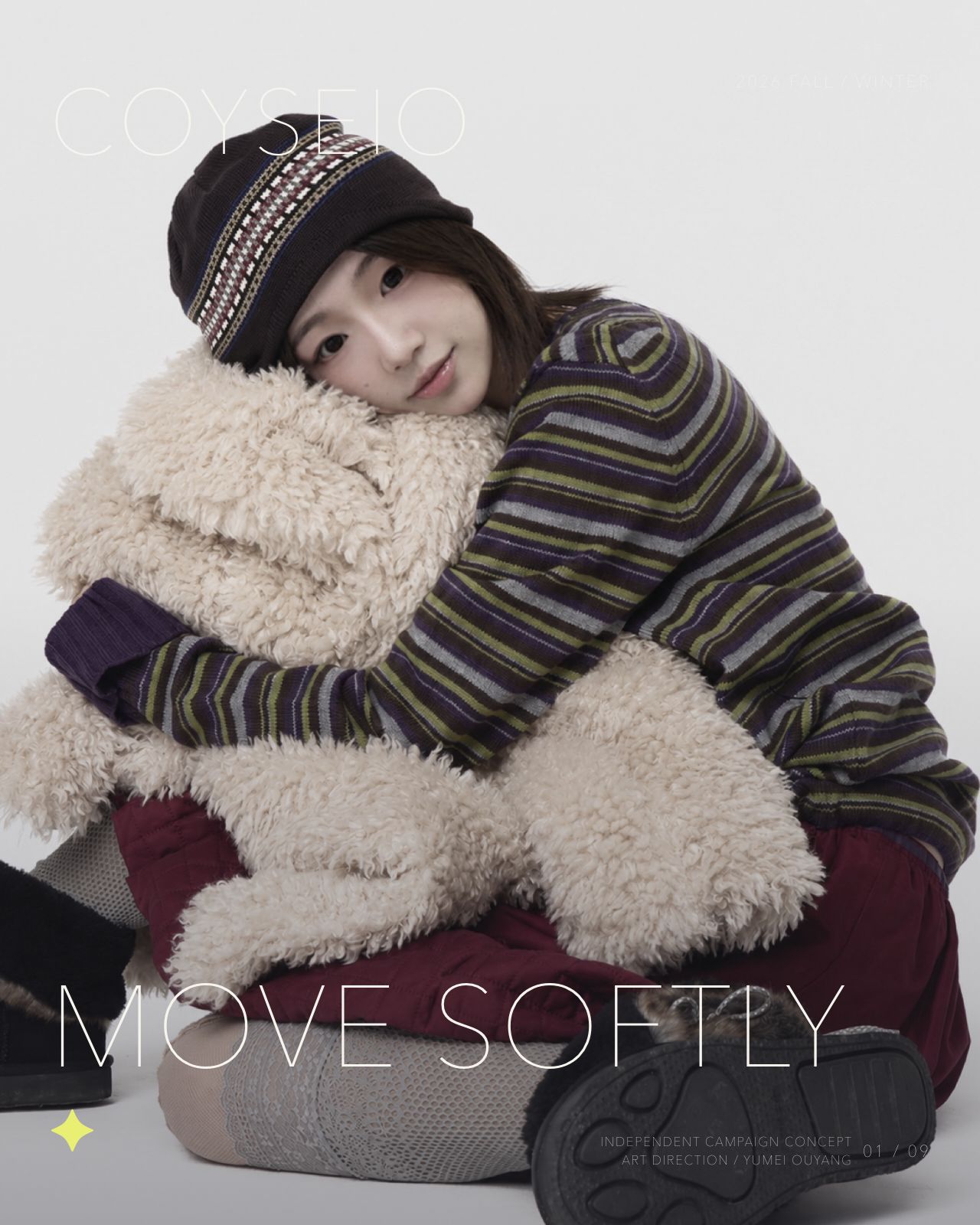
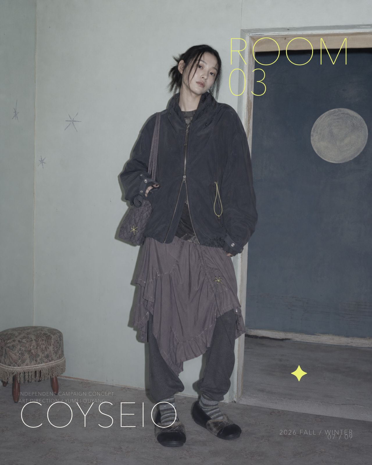
Three distinct models move through tactile comfort, cool utility and a quiet domestic surrealism. Every layout is an independent portfolio concept—not an official COYSEIO campaign.
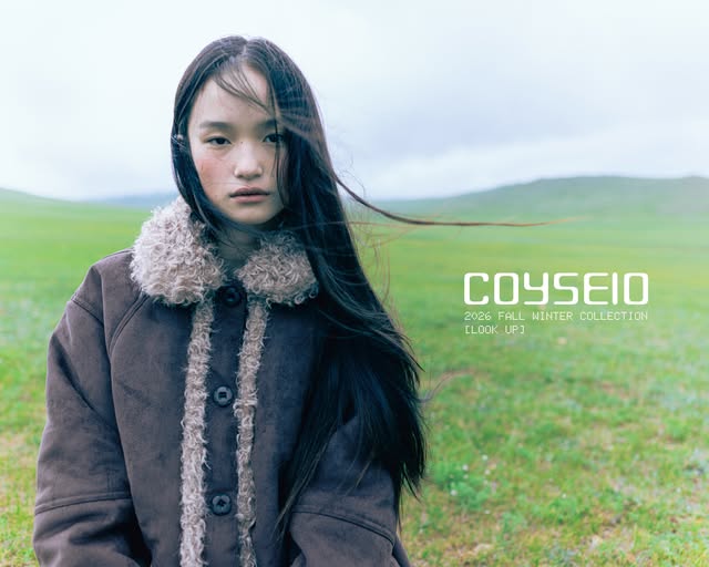 COYSEIO2026 FALL / WINTERMOVE SOFTLY01 / 09INDEPENDENT CAMPAIGN CONCEPT
ART DIRECTION / YUMEI OUYANG
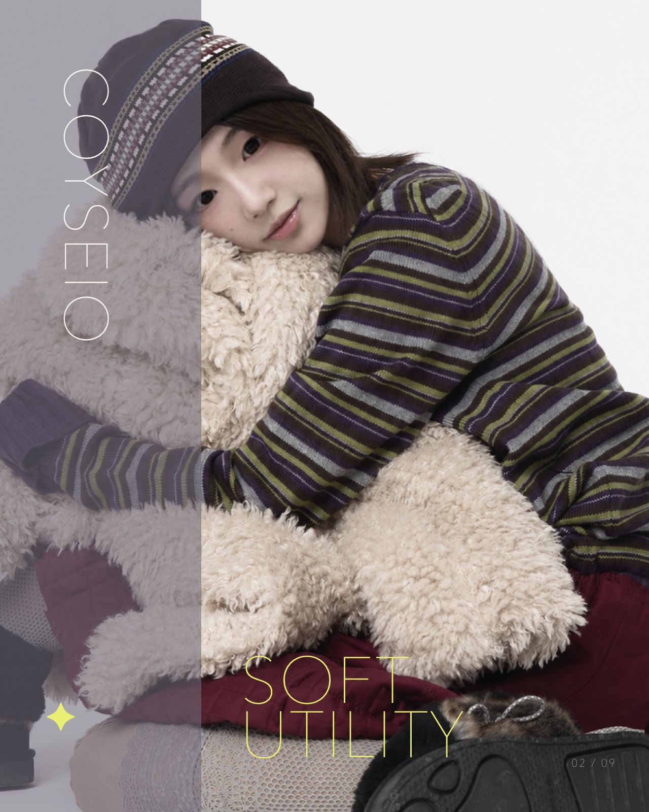
COYSEIO2026 FALL / WINTERSOFT UTILITY02 / 09INDEPENDENT CAMPAIGN CONCEPTART DIRECTION / YUMEI OUYANG
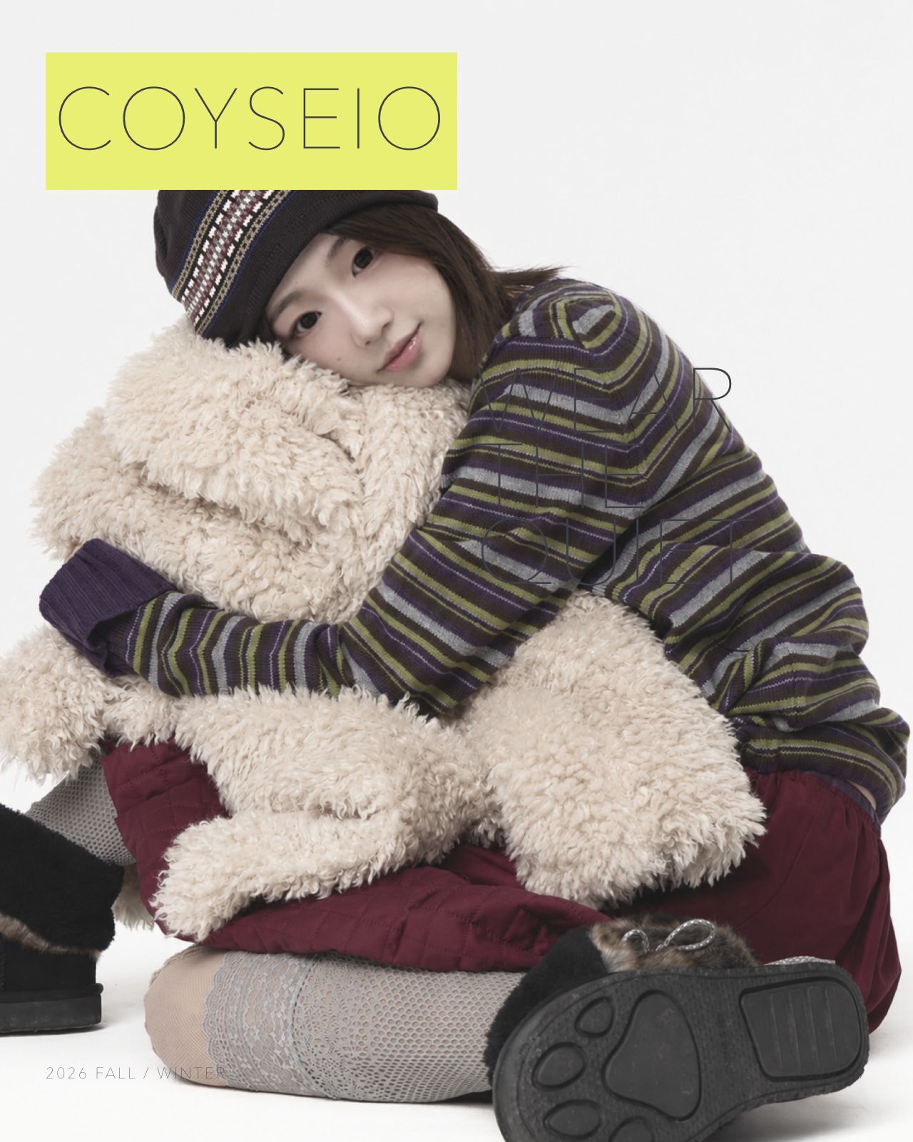
 COYSEIO2026 FALL / WINTERWEAR THE QUIET03 / 09INDEPENDENT CAMPAIGN CONCEPT
ART DIRECTION / YUMEI OUYANG
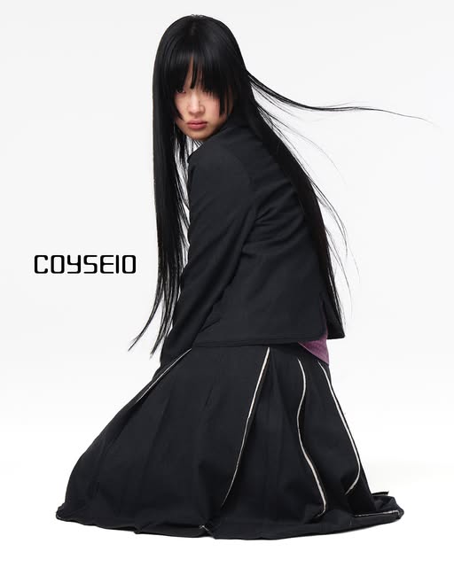 COYSEIO2026 FALL / WINTERSTAY STRANGE04 / 09INDEPENDENT CAMPAIGN CONCEPT
ART DIRECTION / YUMEI OUYANG
COYSEIO2026 FALL / WINTERWINTER IN MOTION05 / 09INDEPENDENT CAMPAIGN CONCEPTART DIRECTION / YUMEI OUYANG
 COYSEIO2026 FALL / WINTERLIGHT / LAYER / MOVE06 / 09INDEPENDENT CAMPAIGN CONCEPT
ART DIRECTION / YUMEI OUYANG
 COYSEIO2026 FALL / WINTERROOM 0207 / 09INDEPENDENT CAMPAIGN CONCEPT
ART DIRECTION / YUMEI OUYANG
COYSEIO2026 FALL / WINTERLOW LIGHT / HIGH FEELING08 / 09INDEPENDENT CAMPAIGN CONCEPTART DIRECTION / YUMEI OUYANG
 COYSEIO2026 FALL / WINTERMOVE SOFTLY / STAY STRANGE09 / 09INDEPENDENT CAMPAIGN CONCEPT
ART DIRECTION / YUMEI OUYANG
HOW
SKETCH · BUILD
CHECK THE WEIGHT
REFINEMENT
What changed
The first styling felt too light for winter, while the next volume test became too bulky.
Response
I simplified the sketch, reduced unnecessary padding and kept warmth through knit, skirt and leg layers. The final full-body image confirms a clearer, more wearable silhouette.
MY VISUAL LANGUAGE / PERSONAL STYLE EXPLORATION
This is how
I observe fashion.
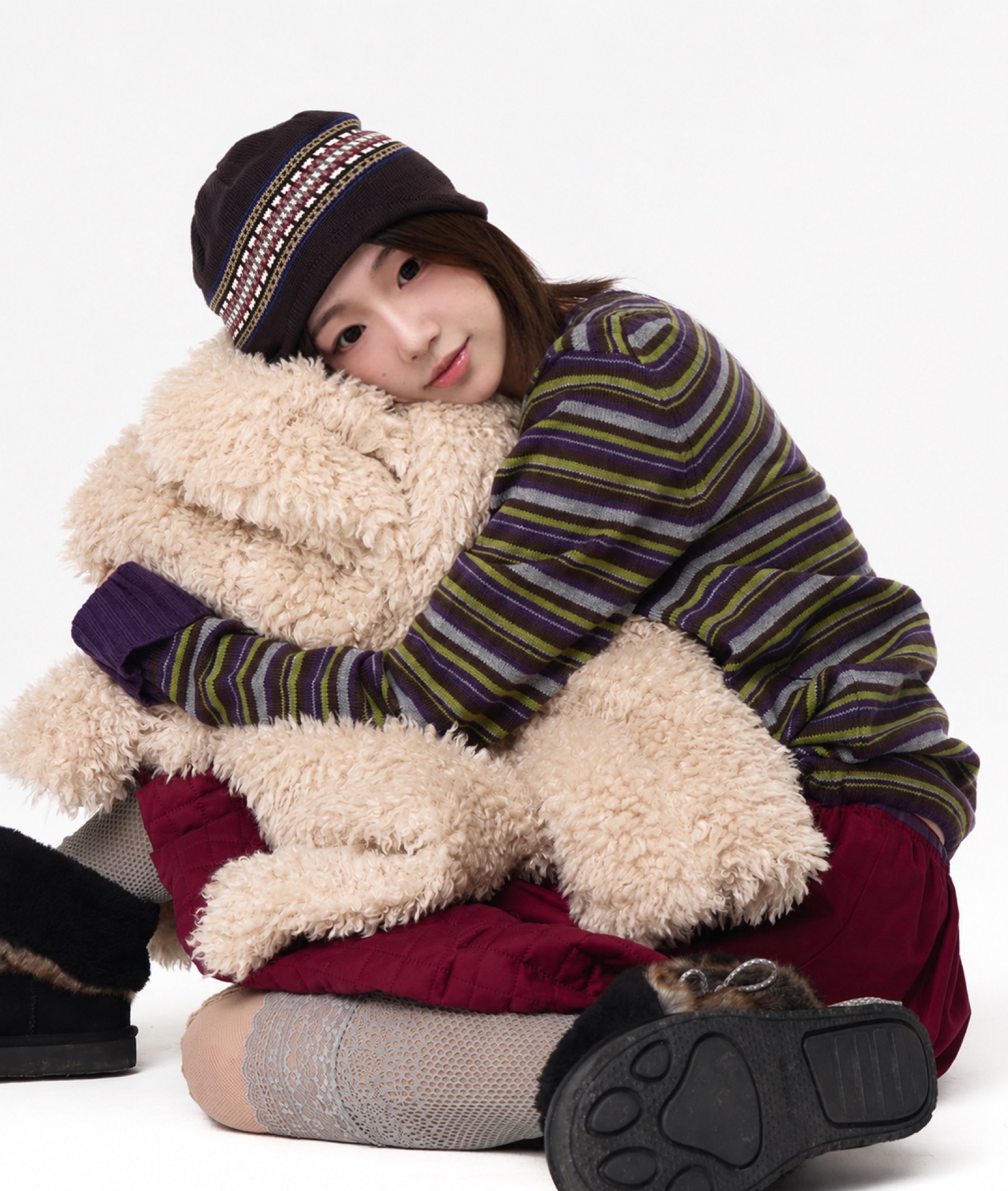
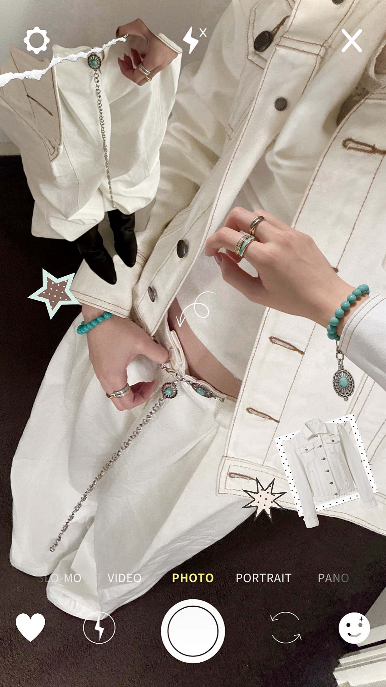
These selected outfits demonstrate how I naturally explore proportion, layering, restrained colour and tactile materials in my own wardrobe. They form personal evidence for the visual judgement behind Soft Utility—not a separate fashion diary.
WHAT THE IMAGES EVIDENCE
Soft proportion
Close, rounded posture and tactile surfaces create emotional warmth.
Utility detail
Visible seams, metal fastenings and controlled accessories give function a personal character.
01Layering02Neutral palette03Relaxed tailoring04Oversized silhouettes05Texture06Quiet details07Everyday utility08Visual storytelling
My personal style→Visual preferences→Brand research→Soft Utility→Campaign development→Final outcome
Developing Soft Utility helped me recognise that my personal visual language naturally aligns with COYSEIO's approach to contemporary fashion. I translated an everyday sensitivity to proportion, texture and quiet detail into a professional campaign concept—strengthening my skills in research, styling, visual storytelling and art direction.
FINAL DELIVERABLES / WHAT I CREATED + WHY IT EXISTS
One concept.
A complete campaign system.
The final outcome is not a garment collection. It is a strategic and visual communication proposal showing how I would contribute inside a fashion creative team.
REFLECTION / EMPLOYMENT READINESS
What changed
in my practice?
A strong fashion campaign is not only an image system. It must connect brand evidence, product logic, audience understanding and a clear creative proposition.
Tutor questions shifted the project from a visual showcase to a documented case study. Peer discussion helped me remove unnecessary bulk and improve colour continuity.
Official lookbooks and Korean fashion presentation taught me to show complete silhouettes, context, detail and multiple views so styling remains product-legible.
I can now demonstrate how I research an existing brand, make styling and art-direction decisions, test them, acknowledge ownership and present a professional campaign proposal.